04.11.11
Meteorology 101: Contours and Other Symbols on Weather Maps
Last week in the weather education series we went over how to decode surface maps; i.e., how to plot weather data and how to interpret data that has already been plotted. Now we’ll make more sense of all the weather data by contouring some of the data.
Contouring Weather Maps
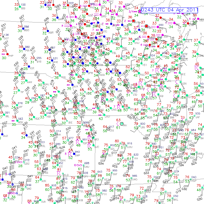
Take a look at the surface map we used as an example last week.
Even if we know how to read this map, we’ll be able to more quickly interpret what’s going on if we draw some contours and other symbols.
By drawing contours, I mean drawing isolines: lines of equal measurement.
For example, say we want to contour temperature every 5 degrees, starting with 60 °F. We will then look the temperature recorded at each station, and draw a line through where we expect to find a temperature of 60 °F. Areas above 60 °F will be on one side of the line, and areas below 60 °F will be on the other side of the line. Points with a temperature of exactly 60 °F will be on the line. The next step would be to draw a contour of 55 °F or 65 °F, until we have drawn lines every 5 degrees.
There are a few rules when it comes to drawing contours.
- Contours should never cross or touch (it surely can’t be both 60 °F and 70 °F at the same point!)
- Contours should be smooth; no corners (this isn’t dot-to-dot…contours should be a bit rounded)
- Do not draw in any more details than the data allow (you should not draw dramatic curves where there is no station data to support this…also, you should not draw a 60 °F circle inside a 65 °F circle unless there is a station inside the circle with a temperature of less than 60 °F)
- Contours should be closed or reach the edge of the map (do not start a line in the middle of the map or leave one hanging)
- Contours should be labeled (don’t forget to write 60 °F on or at the end of the 60 °F contour)


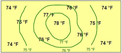
Here is a simplified example of drawing temperature contours every 1 degree:
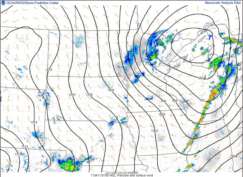
And here is an example of pressure contours every 2 millibars (along with wind barbs and radar reflectivity) from the Storm Prediction Center last night:
Types of Contours
Here are the names for a few common types of contours, or isolines (remember “iso” means “equal”)
- isotherms – lines of equal temperature
- isobars – lines of equal pressure (remember the basic pressure measurement is a bar, or millibar)
- isodrosotherms – lines of equal dewpoint temperature
- isotachs – lines of equal wind speed
- isoheights – lines of equal heights (we’ll get to what this means later, once we move to upper-air maps)
So, for example, the first simplified map showed isotherms, while the map of the Midwest and Northern Plains showed isobars. You will often see isobars plotted on surface maps.
Other Weather Symbols
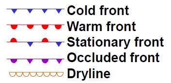
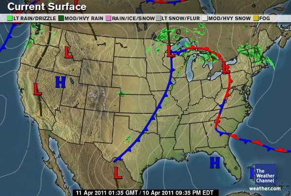
You may also see the following front and dryline symbols commonly plotted on surface maps, as well as a large red “L” indicating a low pressure center and a large blue “H” indicating a high pressure center. We will talk about fronts and drylines later in the series.
Here’s a map from The Weather Channel from last night, showing isobars, radar, lows and highs, and fronts (ignore the brown dashed lines for now…those are troughs).
————————————————–
Next Monday we will move on to upper-air maps!
