04.18.11
Meteorology 101: Upper-Air Maps
Last week in the weather education series we looked at contouring weather maps, in an effort to make the weather data easier to quickly understand. Now that we have covered surface maps, we’ll move on to making sense of upper-air maps.
Pressure Surfaces
Before we study the data shown on an upper-air map, we first have to understand what an upper-air map is.
Most of the time, when looking at upper-air maps, meteorologists are looking at the observations on a constant pressure surface rather than a constant height/altitude surface. This means that no matter where you look on that map, the pressure will be the same.
For example, a 5,000-m map would be a slice of the atmosphere at 5,000 m, such that everywhere on the map is 5,000 m above sea level. You would then have observations across the map reporting different pressure readings.
On the other hand, a 500-mb map would be a slice of the atmosphere at 500 mb, such that everywhere on the map has a pressure reading of 500 mb. In this case, you would have observations across the map reporting different altitude readings (i.e., at what height the pressure 500 mb was found).
This may sound somewhat strange, but it is customary for meteorologists to use pressure, rather than altitude, as a vertical coordinate, in order to simplify thermodynamic computations (we won’t get into that here).
Common Pressure Surfaces
Here are some common pressure surfaces that we look at, and the approximate altitude of each (varies by latitude, time of year, and atmospheric factors):
- 850 mb — 1.5 km
- 700 mb — 3.0 km
- 500 mb — 5.5 km
- 300 mb — 9.0 km
- 250 mb — 10.5 km
- 200 mb — 12.0 km
(Remember that pressure decreases with height, and standard sea-level pressure is 1013 mb.)
500 mb is a standard pressure surface for the mid-levels of the atmosphere…if I could only look at one upper-air map, I’d pick this one, so I can get a good overview of troughs, ridges, and mid- to upper-level winds.
The jet stream (band of fast moving air that circles the globe, high up in the atmosphere…more on this in a future post) is best seen on a 200 mb, 250 mb, or 300 mb map. We’ll get more into what levels are good for what later on.
Upper-Air Map Example
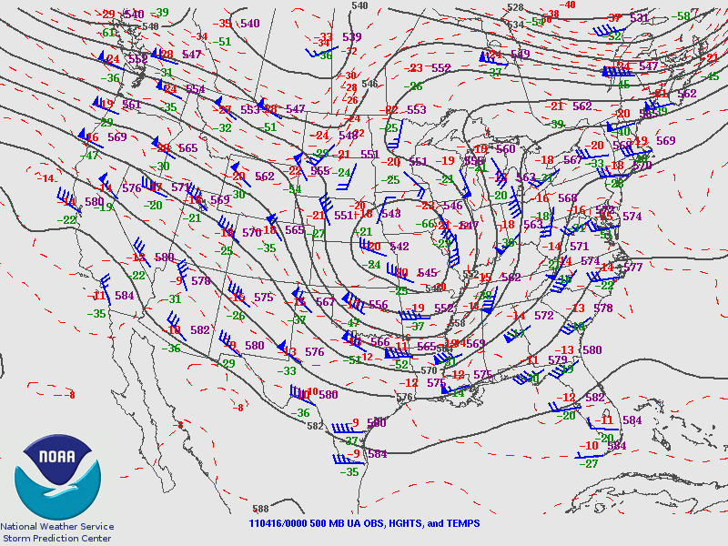
Here is an example of an upper-air map from the Storm Prediction Center (more maps can be found here).
The bottom of the map (click to enlarge) tells you what the map is showing: 110416/0000 500 MB means this is a 500-mb (mid-level) map containing data from 16 April 2011 at 00Z, or 7 pm Friday if you live in the US central time zone. UA OBS means upper-air observations are shown, HGHTS means the pressure heights are contoured (solid gray), and TEMPS means the temperatures are contoured (dashed red).
Upper-air symbols are interpreted much the same way as surface symbols, except for surface temperature and dewpoint are given in °F in the US, while upper-air temperature and dewpoint are always given in °C (don’t ask me why!). Also, remember that instead of pressure observations at each station, we report height observations (e.g., the altitude at which the pressure reads 500 mb).
There are also some special rules about interpretation of height values, such as in this case the units are decameters, so a value of 584 means 5,840 meters. For now anyway, though, the values are not that important.
The important thing here is to note the overall pattern. There was a trough of low pressure over the central US this day, and a ridge of high pressure over the eastern US. Later in the series we’ll get more into what these terms mean.
————————————————–
Next Monday we will move on to interpreting balloon soundings, another type of weather map/chart!
