04.04.11
Meteorology 101: Decoding Surface Weather Maps
Last week in the weather education series we finished up our discussion of measurements by looking at lightning detection networks. This week we’ll start to go over interpretation of weather maps.
Decoding Surface Weather Maps
Now that we have all of our meteorological measurements, what do we do with them? How do we organize them in a manner that will best show us what the weather is doing?
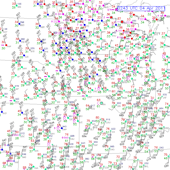
Let’s begin with a surface map (click to enlarge).
This surface observation map, from RAP/NCAR/UCAR, shows a combination of temperature, dewpoint, pressure, wind, cloud cover, visibility, and significant weather at numerous stations in the Midwest last night.
How do we read this?
- a weather station is located at each circle
- cloud cover is indicated by how much the circle is filled in (i.e., clear is an open circle, partly cloudy is a quarter or half filled, overcast is completely filled in)
- temperature (°F on US surface maps) is given by the number to the upper left of the circle (on this map, it’s the red number)
- dewpoint (°F on US surface maps) is given by the number to the lower left of the circle (on this map, it’s the green number)
- wind direction is indicated by the direction the staff connected to each circle is coming from…for example, most of the stations in Iowa are reporting northwest winds (winds coming from the northwest)
- wind speed is indicated by the number of barbs attached to the staff, where one short barb is 5 knots (1 knot = 1.15 mph), one long barb is 10 knots, and one pennant (none shown here) is 50 knots. If there is no staff, but just a circle around the station marker, the winds are calm
- pressure can be derived from the number to the upper right of the circle, but it’s a bit tricky, as numbers are given in tenths of millibars, and the leading 9 or 10 is dropped…the general rule is if the number is less than 500, add a “10” to the front, otherwise add a “9” to the front. This map doesn’t show all of the pressure measurements, but look at Topeka (TOP) in northeast Kansas, for an example…the station reads “951”, but this is NOT 951 mb…that’s much too low. The value is greater than 500, so add a 9 to the front and you have 995.1 mb, which makes sense (if you accidentally said 1095.1 mb, you should know that would be extremely high pressure!)
- significant weather is indicated by a symbol in between the temperature and dewpoint; some common symbols are given at this Unisys site (as well as more details on decoding stations). The most common ones are rain (dots…2 meaning light rain, 3 moderate, 4 heavy), snow (stars), thunderstorms (arrow and a line…see Topeka area), fog (horizontal lines), and haze (infinity)
- visibility is given by the number to the left of the significant weather symbol…this map only shows visibility if it is below a certain threshold (I think it’s given in miles here, but is sometimes given in quarter or eighth miles)
In case you were wondering why the circles are color-coded on this map: this map also shows flight conditions in terms of whether instrument/visual flight rules are in place…but that’s not important for our purposes.
Wow, that’s a lot of information!
Now let’s look at Topeka again, to decode that station as an example.
At Topeka, the temperature is 56 °F, the dewpoint is 48 °F (meteorologists would often say it is “56 over 48”), the pressure is 995.1 mb, skies are overcast as there is a thunderstorm present, and winds are from the northwest at 15 knots (~17 mph), gusting to 26 (that’s what the “G” is near the wind barbs of some stations).
For another example, check out Milwaukee, Wisconsin (southeast part of the state, indicated by MKE). It is 45 over 36, mostly cloudy with light rain (two dots), and the wind is out of the north-northeast at 5 knots (about 5 mph). No pressure is given.
————————————————–
Next Monday we will talk more about surface maps, including how to contour the data!
Permalink Comments off
