04.04.11
Posted in Weather Education at 8:00 am by Rebekah
Last week in the weather education series we finished up our discussion of measurements by looking at lightning detection networks. This week we’ll start to go over interpretation of weather maps.
Decoding Surface Weather Maps
Now that we have all of our meteorological measurements, what do we do with them? How do we organize them in a manner that will best show us what the weather is doing?
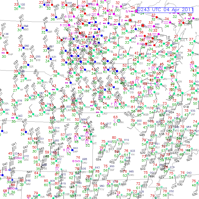
Let’s begin with a surface map (click to enlarge).

This surface observation map, from RAP/NCAR/UCAR, shows a combination of temperature, dewpoint, pressure, wind, cloud cover, visibility, and significant weather at numerous stations in the Midwest last night.
How do we read this?
- a weather station is located at each circle
- cloud cover is indicated by how much the circle is filled in (i.e., clear is an open circle, partly cloudy is a quarter or half filled, overcast is completely filled in)
- temperature (°F on US surface maps) is given by the number to the upper left of the circle (on this map, it’s the red number)
- dewpoint (°F on US surface maps) is given by the number to the lower left of the circle (on this map, it’s the green number)
- wind direction is indicated by the direction the staff connected to each circle is coming from…for example, most of the stations in Iowa are reporting northwest winds (winds coming from the northwest)
- wind speed is indicated by the number of barbs attached to the staff, where one short barb is 5 knots (1 knot = 1.15 mph), one long barb is 10 knots, and one pennant (none shown here) is 50 knots. If there is no staff, but just a circle around the station marker, the winds are calm
- pressure can be derived from the number to the upper right of the circle, but it’s a bit tricky, as numbers are given in tenths of millibars, and the leading 9 or 10 is dropped…the general rule is if the number is less than 500, add a “10” to the front, otherwise add a “9” to the front. This map doesn’t show all of the pressure measurements, but look at Topeka (TOP) in northeast Kansas, for an example…the station reads “951”, but this is NOT 951 mb…that’s much too low. The value is greater than 500, so add a 9 to the front and you have 995.1 mb, which makes sense (if you accidentally said 1095.1 mb, you should know that would be extremely high pressure!)
- significant weather is indicated by a symbol in between the temperature and dewpoint; some common symbols are given at this Unisys site (as well as more details on decoding stations). The most common ones are rain (dots…2 meaning light rain, 3 moderate, 4 heavy), snow (stars), thunderstorms (arrow and a line…see Topeka area), fog (horizontal lines), and haze (infinity)
- visibility is given by the number to the left of the significant weather symbol…this map only shows visibility if it is below a certain threshold (I think it’s given in miles here, but is sometimes given in quarter or eighth miles)
In case you were wondering why the circles are color-coded on this map: this map also shows flight conditions in terms of whether instrument/visual flight rules are in place…but that’s not important for our purposes.
Wow, that’s a lot of information!
Now let’s look at Topeka again, to decode that station as an example.
At Topeka, the temperature is 56 °F, the dewpoint is 48 °F (meteorologists would often say it is “56 over 48”), the pressure is 995.1 mb, skies are overcast as there is a thunderstorm present, and winds are from the northwest at 15 knots (~17 mph), gusting to 26 (that’s what the “G” is near the wind barbs of some stations).
For another example, check out Milwaukee, Wisconsin (southeast part of the state, indicated by MKE). It is 45 over 36, mostly cloudy with light rain (two dots), and the wind is out of the north-northeast at 5 knots (about 5 mph). No pressure is given.
————————————————–
Next Monday we will talk more about surface maps, including how to contour the data!
Permalink
03.28.11
Posted in Weather Education at 8:00 am by Rebekah
Last week in the weather education series we looked at weather satellites. This week we’ll wrap up meteorological measurements with lightning detection networks.
This discussion will be limited to two lightning detection networks: the U.S. National Lightning Detection Network (NLDN) and the 3D Lightning Mapping Array (LMA).
National Lightning Detection Network
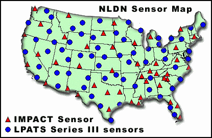
The NLDN, established in 1989, is a network of over 100 sensors spread across the United States (there is also a similar lightning detection network in Canada, and together the networks are called the North American Lightning Detection Network).
Put simply, the sensors detect electromagnetic radiation from lightning ground strikes (cloud-to-ground, or CG flashes). The time of the strike, strike location, current magnitude (i.e., strength of the strike), current polarity (e.g., positive or negative), and number of return strokes is recorded for each observed CG flash. The strike location is determined by triangulation.

Map of the NLDN sensors. There are two types of sensors indicated on the map.
3D Lightning Mapping Array
There are currently three 3D lightning mapping arrays (LMAs) in operation in the U.S., all set up under the direction of New Mexico Tech. The LMAs are located in New Mexico, central Oklahoma, and northern Alabama.
My work in the lightning research department at the University of Oklahoma has dealt extensively with the Oklahoma LMA, run by a group in the National Severe Storms Laboratory.
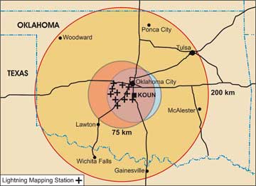
The OK-LMA consists of 11 stations in west central Oklahoma, each of which is equipped with a very high frequency (VHF) antenna, to detect the radiation produced by the lightning, and a time-of-arrival sensor, to determine time and location information about the VHF radiation points from both intracloud (IC) and CG lightning flashes.
We can then use this VHF data for various purposes, such as finding out where and when the lightning flash initiated. This was a large part of my research for my M.S. degree.

The plus symbols show the location of each LMA station in Oklahoma, the orange circle shows the range of the 3D LMA, and the yellow circle shows the range of the LMA for just 2D data (the inner, pinkish to blue circle is the range of the polarimetric radar KOUN).
————————————————–
Next Monday we will move on to weather maps!
Permalink
03.21.11
Posted in Weather Education at 8:00 am by Rebekah
Last week in the weather education series we looked at weather radars; this week we’re going to take a look at weather satellites.
Types of Satellites
There are two major types of satellites: polar and geostationary.
Polar satellites orbit the earth from pole to pole. This allows the satellite to take images of pretty much the entire earth.
Geostationary satellites orbit the earth around the equator, but they are so far out in space (about 36,000 km, or 22,500 miles) that they practically remain stationary above a certain spot on earth.
Most of the U.S. weather satellite images you see are from the GOES series (Geostationary Operational Environmental Satellite), from either GOES-11 (GOES West, at 135°W over the Pacific Ocean) or GOES-13 (GOES East, at 105°W approximately over the Rockies). GOES-12 (GOES South, formerly GOES East at 75°W over the Amazon River, off the East Coast) was placed into standby in April 2010.
Europe and Africa is imaged by the European Meteosat series, operated by EUMETSAT.
The western Pacific, including Australia and eastern Asia, is imaged by the Japan Meteorological Agency’s MTSAT.
Weather Satellite Channels
There are three primary bands: visible, infrared, and water vapor.
- Visible (0.4 – 0.7 µm) – this band is in the visible range, so this is what the earth would look like if you were in space. It is based on reflected sunlight, so these images are only available during the day. Visible satellite images show cloud tops, and the thicker the clouds, the whiter they appear on the satellite image.
- Infrared (11 – 12 µm) – this band is in the infrared (longer wavelength) range, so this is in effect sensing heat. From an infrared satellite image, we can deduce the cloud-top temperature. Infrared satellite images are lower-resolution than visible satellite images, but they are available night and day (since they don’t depend on the visible range). The higher the cloud tops, the whiter they appear on a visible satellite image.
- Water vapor (6.7 µm) – this band detects water vapor in the mid-levels of the atmosphere. This can be helpful for determining winds/troughs/ridges/etc. in the mid-levels. It is important to note that just because you see a stripe across a water vapor image, doesn’t mean there are any clouds there (it could just be moisture in the air). These images also are available night and day. Color schemes depend on the website you’re looking at; if it is a black and white image, the whiter the region, the more the moisture. Water vapor images are often colored, and typically higher moisture content will be shown in purples and/or greens, with drier air shown in reds and/or oranges.
Check out a few satellite sites for examples!
NOAA GOES
College of DuPage (has regional satellite images and my favorite for hi-res visible images)
EUMETSAT (Europe, Africa)
————————————————–
Next Monday we will talk about lightning detection systems.
Visible (0.4 – 0.7 µm) – this band is in the visible range, so this is what the earth would look like if you were in space. It is based on reflected sunlight, so these images are only available during the day. The thicker the clouds, the whiter they appear on a visible satellite image.
Permalink
03.14.11
Posted in Weather Education at 8:00 am by Rebekah
Last week I described how upper-air observations are made with radiosondes. This week we’re going to start looking at remote sensing observing systems, beginning with radar.
Radar

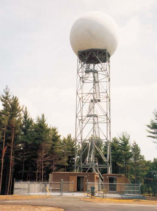
(Photo from the National Weather Service in Seattle)
Radar stands for radio detection and ranging. A radar system emits high power radio waves, some of which bounce off objects (e.g., raindrops and snowflakes) and return to the radar. The round-trip time of the energy pulse is used to calculate the distance of an object from the radar.
The current generation of weather radars in use by the National Weather Service is the WSR-88D, standing for Weather Surveillance Radar, 1988 Doppler. These radars, as you can probably guess, were established in the ’80s and are Doppler radars.
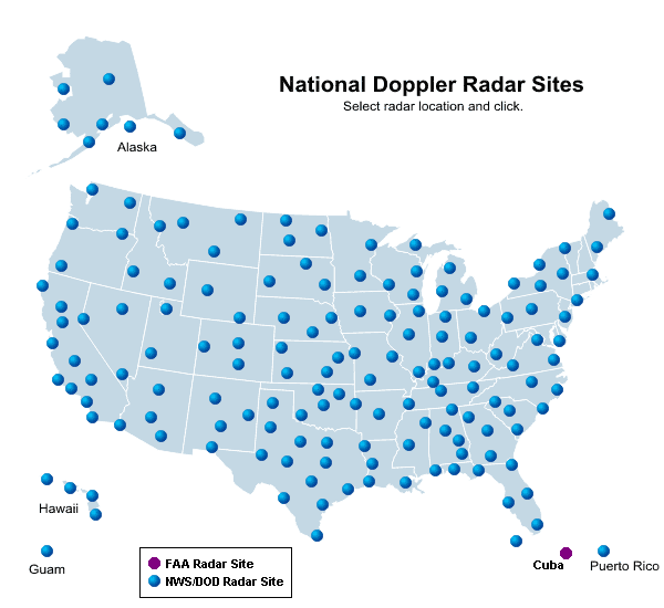
The following map shows the locations of the National Weather Service radars.

Doppler Radar
Consider a passing train, blowing its whistle. As the train moves away from you, the pitch of the whistle drops. The same goes for emergency vehicles; sirens will sound higher pitched as the vehicle is coming towards you, and lower pitched as the vehicle is going away from you.
This shift in frequency is known as the Doppler shift, and we can apply this principle to radars, in order to determine the wind speed and direction across the radar domain (e.g., useful in determining when a tornado may be present, where we have rotating winds).
Other Radars
There are numerous other types of radars used to observe precipitation and wind as well, such as dual-pol and phased-array radars and wind profilers.
A wind profiler is a type of radar or sodar (uses radio or sound waves) that points up and gives frequent updates on wind speed and direction over a certain location. This is helpful as we only have soundings go up twice a day, and sometimes we may want to know what the winds are doing in-between soundings. Most wind profilers are located in the central U.S.
————————————————–
Next Monday we will talk about weather satellites.
Permalink
03.07.11
Posted in Weather Education at 8:00 am by Rebekah
While last week we looked at how surface observations are made, this week we’ll look at how upper-air observations are made, focusing on weather balloons (some measurements may be taken by aircraft, as well).
Radiosondes

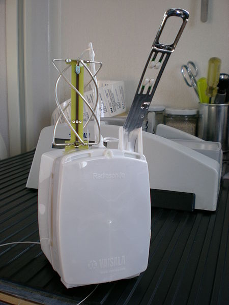
(Radiosonde photo from Wikipedia)
The primary instrument for measuring upper-air weather data is a radiosonde. A radiosonde is a small box that measures temperature, relative humidity, pressure, wind speed and direction, altitude, and GPS location. (Technically, a radiosonde doesn’t measure wind…instruments that do are called rawinsondes, but colloquially we still like to call them radiosondes.)
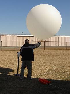
The radiosonde is attached to a large, hydrogen-filled balloon, which can ascend to over 100,000 feet in altitude, at which point the balloon could have expanded to the size of a two-story building! Data is transmitted to the surface throughout the balloon’s flight.

(Photo courtesy of the National Weather Service)
As the balloon expands as it rises (due to lower pressure higher in the atmosphere), it will eventually pop and come back down (sometimes prematurely). The ascension can last for two hours, at which time the instrument may have reached over 100,000 feet in altitude and may have drifted well over 100 miles away from the point of release.
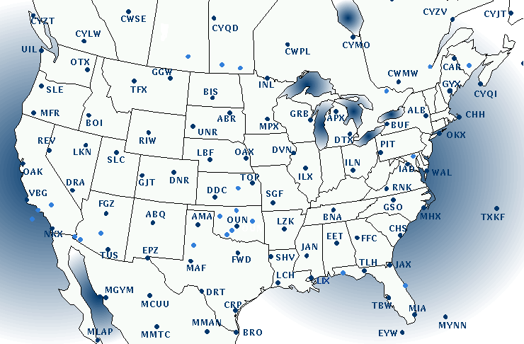
Weather balloons are launched twice a day at over 400 locations around the world, around 12Z and 00Z (remember the universal time zone we talked about recently?). The following figure from the College of DuPage shows where radiosondes are launched in the U.S. (as well as southern Canada and northern Mexico). The light blue spots are supplemental sites where balloons are launched only on special occasion (in case of severe weather, snowstorm, etc.).

We’ll discuss how this upper-air data is plotted a little later in the series.
————————————————–
Next Monday we will take a look at remote sensing observations, including radar and satellite.
Permalink
« Previous Page — « Previous entries « Previous Page · Next Page » Next entries » — Next Page »
